
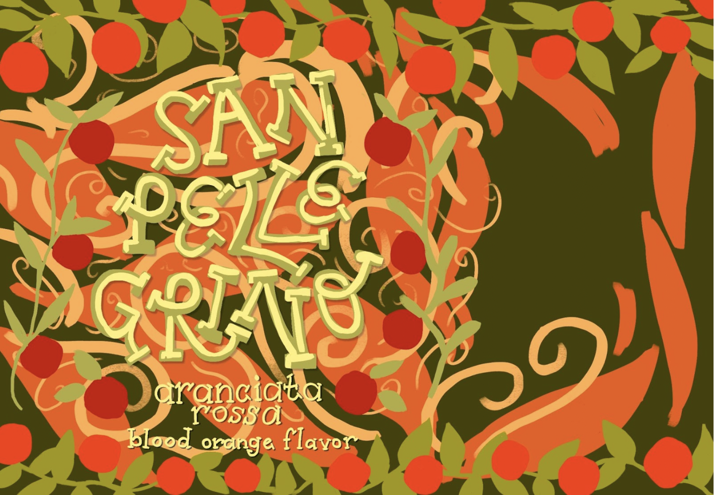
Blood Orange San Pellegrino
In Winter 2025 during my Type and Image for Illustrators course, we were assigned to redesign packaging of our choice, hand-lettering the type on it. I chose San Pellegrino’s Blood Orange italian soda because I find the more modern soda can packagings I see to be very sleek and satisfying to view, and I wanted to see how that look would translate onto my favorite San Pellegrino flavor. I also thought it would be interesting to see how i can make the letters interlock with one another.
Mock up template from Adobe Stock. Illustrated in Adobe Photoshop. Ingredients font from Adobe fonts.
Scroll below to see some of my process!
Ideation / Process
Thumbnails sketches
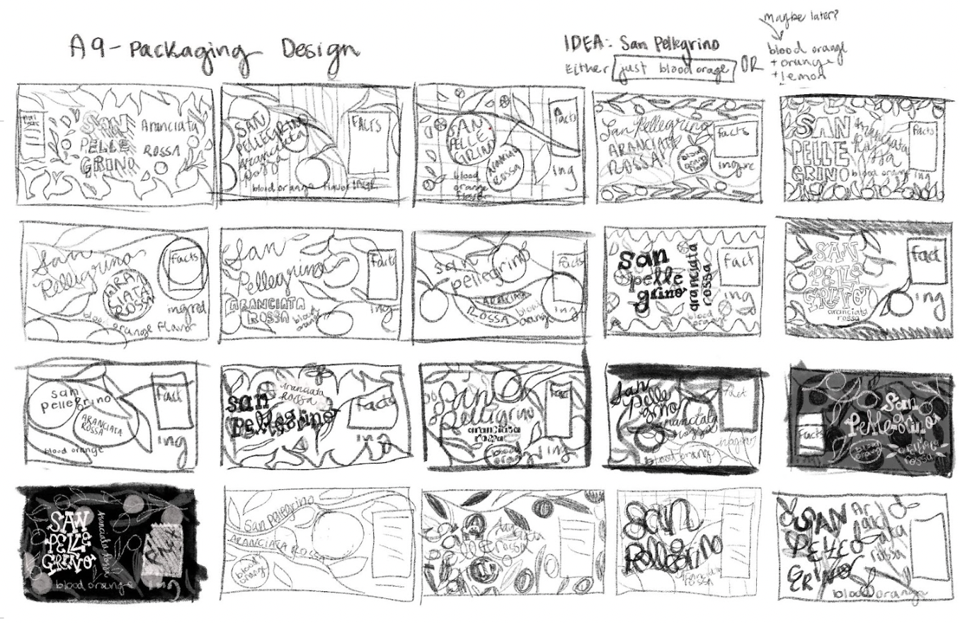
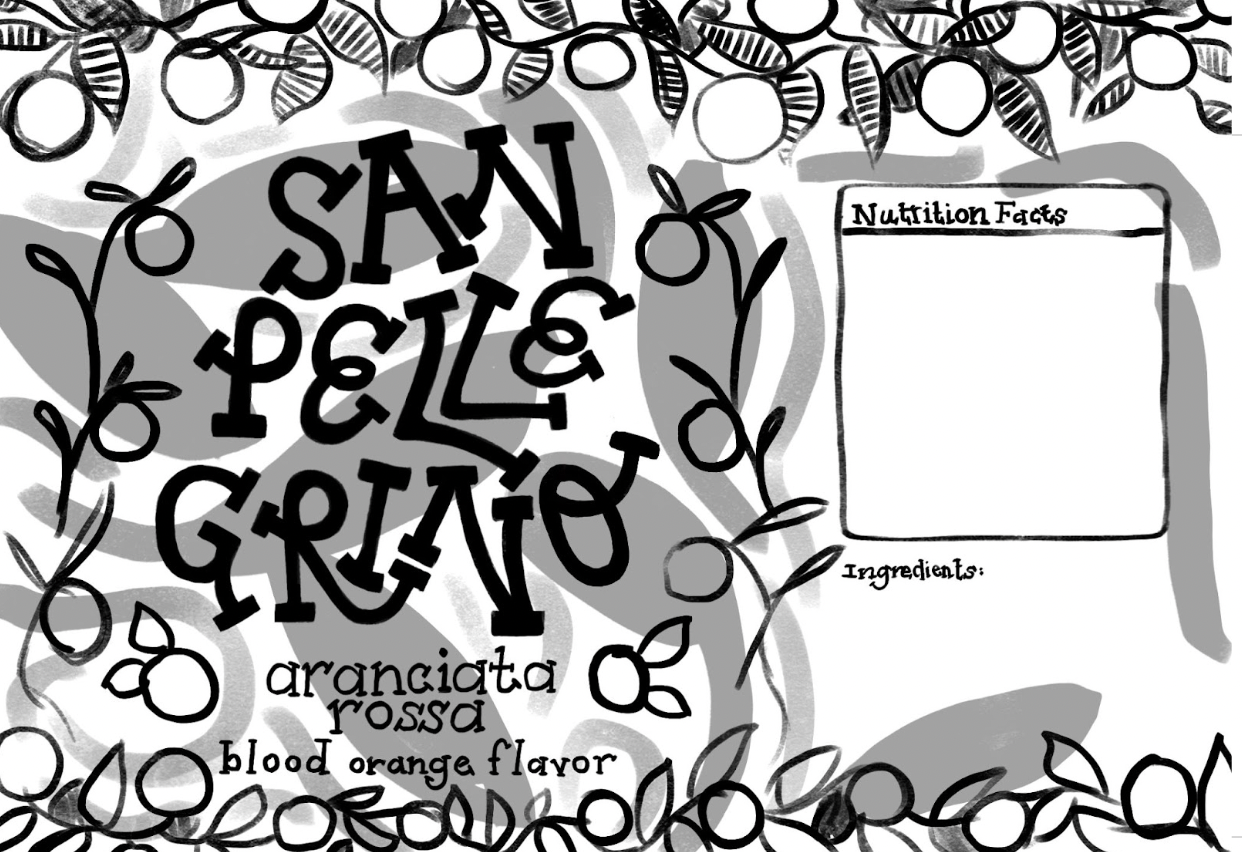
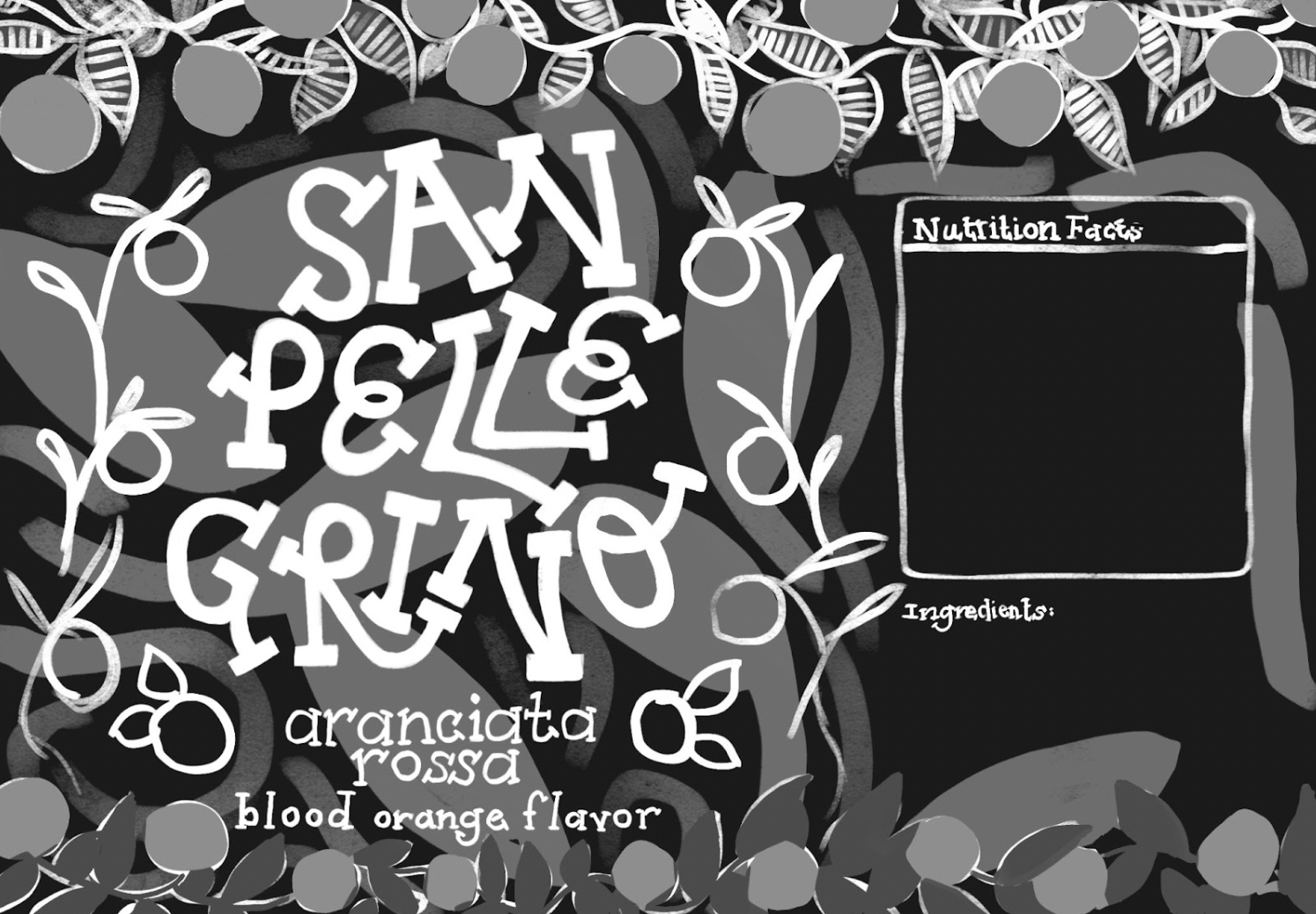
Value compositions, I ended up going with something most similar to the second one
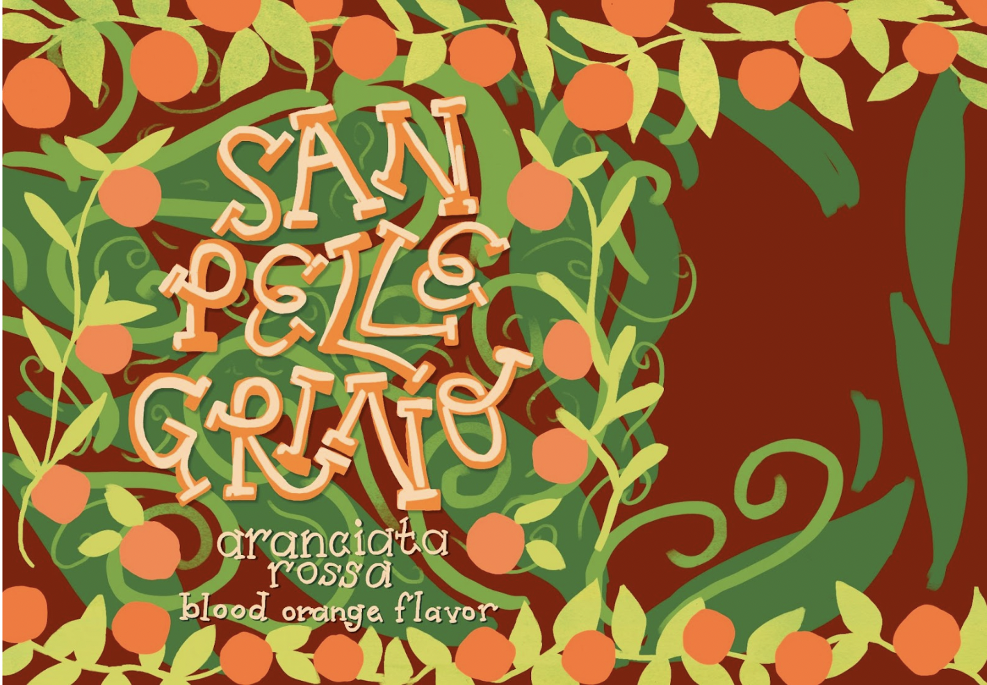
Color compositions, ended up removing all of the leaves behind the San Pellegrino lettering to simplify the composition and improve legibility
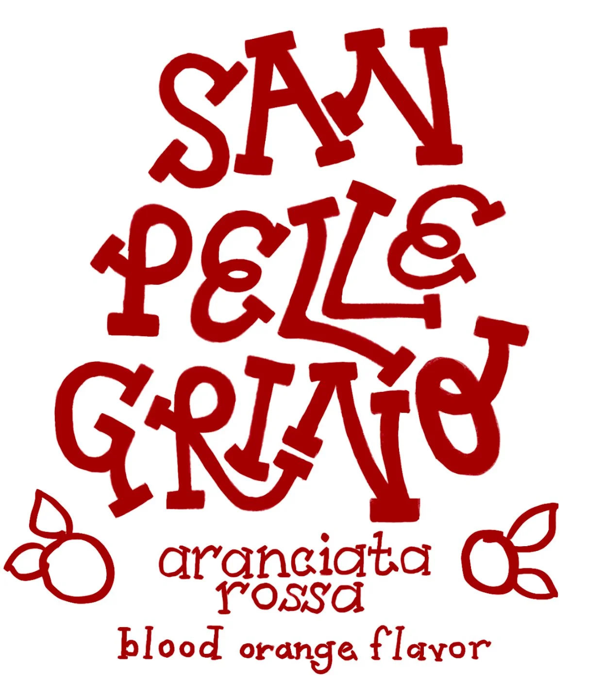
Final linework / lettering
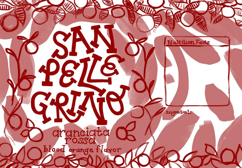
Ideation work done primarily on Procreate